After deciding what I was going to do my paper zine on, I started thinking about what I'd want it to look like and what I wouldn't want it to look like. I did some searching on google for metal music magazines and fanzines to see what different styles there was out there...

When I searched for music fanzines, All that came up were cartoonified, hand made looking books like this, I personally don't want my book to look like this as I'd prefer to use real pictures rather than drawn ones or cartoons, I think the cover looks a tad too crowded and overall it doesn't really look very interesting as the colour scheme is too repetative and boring, theres nothing about it that makes me want to red the book which is what the front cover should do: it should inform you of whats inside and make the reader want to read it- Also I wanted my zine to look a lot more professional then this. Although I do like how the writing is placed everywhere in different ways and how it's also presented in different way(into an explosion drawing etc) and I like how the font's are changing all the time and putting emphasis on certain words more than others.
I then searched for metal music magazines and it came up with quite a variety of different styles for the covers: over all I can say that I don't relly like the look of most of the magazines at all, they were mostly cluttered and had too much on them, there were a few that I quite liked- the more simple ones that had a main picture, some writing and some extra things about whats inside; nothing too over crowded or busy.
 < This magazine cover was one I quite liked as it had a main picture, some writing and extras about whats inside.. only theres a little too much of the extra info parts- it starts to look a little cluttered.
 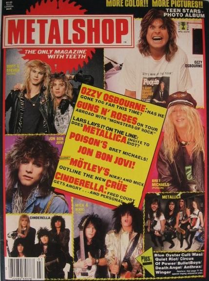 < This magazine was one I really didn't like very much, although it's very different. I think theres a little too many imges used on it, theres a perfect amount of writing though, I also like how the writing has been put in a box in the centre of the cover and the logo/title is in a good place. I don't relly like the colours very much as it reminds me of a cheap woman's weekly magazine.
  < These magazines mostly all have a layout which I really like, the main picture, writing etc are there- it makes me want to read them- they don't look over powering or cluttered and the colours arn't too bright or boring(I don't really like the use of yellow as the main colour in one of them though) I like the placement of the title/name and the fonts used. The covers are pretty simple but effective and this is what I'd like to go for- simple, uncluttered but inviting and matching the band.
I searched for articles after and came across these:
 < This one I don't like because there is far too much writing on the pages as a whole, the text its self looks uninviting and doesn't look like an easy read. I quite like the layout though, the design of the image and the colour scheme.
  < This one I like because the writing amount is spot on, the layout out is a bit strange but I quite like it; the colours I don't like but I'm looking at how the paage is set out more than anything with this image: the quite big picture matched with some writing and the little changes in the text by the black boxes splits up the article well, making it look like theres less to read when there isn't- therefore making it look easier to read.
 < I thought I could create something like this advertising an upcoming gig or past gigs in the zine. I'd really like something like this; band names in big fonts going down the center of the page with the gig date, location and other information at the bottom with some kind of picture of artwork to mix it up.
  < I thought I could make some kind of logo/title that I could using throughout the book. I'd like something like this one, it's not boring and the colours work. I like the design of the background and I like how they didn't just write the two words as two words, they put them together. I also really like the bold font's and how the colour scheme is running throughout.
I looked at different metal CD covers since I'm making one for the band to use in my zine, All CD covers have the same aspects within them: The band name/logo, sometimes the album name, and there's always some artwork to go along with it- the artwork can be to do with what the albums about or it can just be something they think looks good and suits the band's image- it doesn't nessesarily have to be about the albums content.

< I really love the artwork/image on this cover- I think it's beautiful and the colours really stand out, it's really effective. I also rather like the logo although the first letter of the name is a little hard to make out- it's an F but it looks like a T - I'd defiantly have the logo to be clearly readable.
 < I really like this cover although compared to the others it looks quite dull and boring. I love the artwork in the center of it, it's really awesome, fits the album because it's called "universe" and suggests something about the band. I don't relly like how small and hard to read the name of the band is though.
 < I really like this cover because the colours work well together and stand out, the artwork is interesting and different and could have a connection with the album's con tent. I love how bold and clear the name of the band is and the placement of it, it's placed so that it also comes into the artwork at the 'T's'.
  < One thing I hate about this cover and all others that do it, is how the name of the band is unreadable, I don't think theres much point in having a logo or name on anything if its not even readable. I do like the different-ness of the logo though and I really like the artwork and the colours- I like how everything is centred on the cover as well, it's easy on the eyes and brings focus in on the important aspects about the cover.
  < This covers uses a real image, not a computer made image for it's artwork- I really like it as it stands out and make the entire cover look more real and effective- looks as if more effort has been put into it. On the other hand, I don't really like how the writing looks; so plain and boring compared to the image, and the colours of them don't match or go with the colours in the imagery- they mostly likely did this to make the writing stand out but it backfired on them as it stands out in a bad way.
No comments:
Post a Comment