Looking at different effective and interesting advertisements:


Then I looked to see if the "Alessi" cutlery company had any other form of advertising other than the set of pictures they did and I found these two types of advertising videos on YouTube:
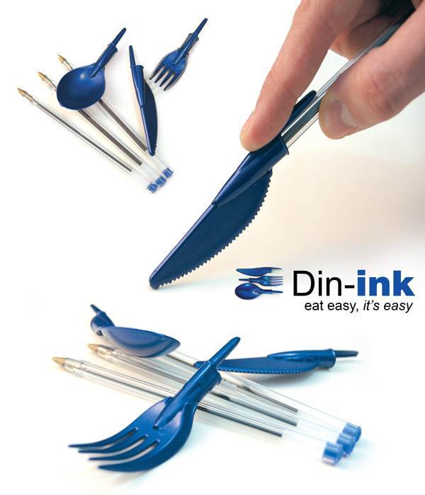
The second video in particlar would be incredibly effective in advertising the products-the video features more than just cutlery- the video is very arty and entertaining to watch as it's contsantly changing. The colours are bold and bright and everything is placed in a way which compliments the images shown- the advert itself tells you alot about the company and it's products with information and with how the video itself is. The images above showing the cutlery being used as chop sticks and placed on a zebra crossing make the product seem more exciting and interesting than it actually is, with the products being placed and used in such strange ways it has a humourous side to it and all together it makes us remember the advertisment and it's product. As well as this the products have being lit and photographed in a way that makes them look more presentable aswell- they are made to look pristine and kind of like diamonds in a way, making something ordinary and boring become more interesting just by lighting it in a certain way. The idea behind these cutlery adverts was to make the viewer remember the makers of the cutlery by creating strange and confusing images that made them question and look at the image for longer which is a very effective way of advertising indeed, considering so many adverts fail to make viewers remember them, where as these images kind of force you to remember in a way.
I choose the Orange adverts to look at and analysis: I mainly found video adverts for them but the image adverts I found told me that the signifiers for orange is obviously the colour, the small square box, also the font they use all three factors make it so you instantly recognise and think of their company. The name itself it pretty huge in working as a instant recognition, you see the colour or the name anywhere- even not on an orange advert and get reminded of it which is really effective because this means that Orange can advertise their company and phones without really needing to add any other signifiers then a small orange box. The things that orange seem to stick with it being funny and random, these things are to be expected when watching or looking at any advert for example the advert below has a chimpanzee on it, to get your attention and then it talks about voice commands.. this is very random and it's effective- over all because it makes you look and read it and as it'd be a poser/billboard as opposed to a video advert people generally don't look at adverts when there out and about much as they're busy and there not forced to look like they would be on a t.v so they don't: but the bright colours and interesting images give the viewers reasons to look.


They did a series of video adverts featuring celebrities where they'd do it in the style of dragons den, make them pitch a movie idea and then the orange team would interrupt and make the idea about phones etc. The videos are effective as they keep repeating the word "Orange" by the end of the video it s stuck in your head so you remember it, another thing which is rememberable about the videos are that they are funny and this coupled with the fact "Orange" is said so much- makes you connect orange with being funny so whenever something funny happens to you, you'd be reminded- and with the videos being funny it might mean people show other people and thus advertising Orange further and the videos feature people in which others would recognise this would make them possibly be interested in watching the advert more:
http://www.youtube.com/watch?v=k8sK2EY0ZuU
http://www.youtube.com/watch?v=wbtlv2cImxM
http://www.youtube.com/watch?v=4xGyU9lzPik
They also did a series of cinema and movie connected adverts that are all done very differently, but all very effective and rememberable. All funny in some ways or another, one give you insight into movie making which would interest people and another puts you in a movie, whilst the first one is a joke about taking the "turn your phones off when in the cinema" rule too seriously and over all each advert is interesting, funny, random and makes you remember Orange:
http://www.youtube.com/watch?v=dOts_bdRxFk
http://www.youtube.com/watch?v=IRczpGsEaRE
http://www.youtube.com/watch?v=zbKPKDGQRr4
My advert idea drafts:


I decided to go for a family angle to my adverts, since most or some families would sit down together and eat a meal every day in which they'd talk, laugh and rant about their day. I picked a picnic setting at first as I wanted the image to obviously say that family times were happening: The shot I had in mind as a picnic table cloth with a doily on top, which has the cutlery on it going diagonal across the page, I wanted the shot to be close up so the detail and shine in the cutlery could be seen clearly, I also wanted it so that the viewer would take in the other information about the image: the picnic table etc but it still be clear the main focus was the cutlery. My first tag line was "Bringing your family closer" because spending time with you family will bring you closer, and having a picnic or dinner with the cutlery will be one of the main ways a family gets to spend time with each other few the busy week time. I then went onto thinking about how I could do the shot/idea differently- incorporating the family eating with the cutlery in the image and more information about where they are but also have the close up shot of the cutlery shining that I wanted: so I came to the decision to shot two images separately and edit them together, a birds eye view of the family picnic and then a close up studio shot of the cutlery- I thought this idea might be a bit too busy and too much to take in though.
When it came to the next day and we had to shoot a first attempt at our ideas, I was confused in how I would do the second idea, and I didn't have any of the picnic stuff with me because I didn't know we'd be shooting til I came in. I had to think of a way to incorporate both ideas in a way: I didn't have a family so I couldn't involve people in the image and all I had was the cutlery and a table... so I decided to shoot the image as if the family had just finished eating and all that was left on the table was the cutlery. I tried the birds eye view shot of it but I didn't like it so I tried taking the image at different angles and the angle below is the one I settled on: the lines of the table lead you into the image, into the text and theres just the right amount of view of the cutlery in it. When I take the image again I may get more of the cutlery, a bit closer too. I chose to light the image from above with two lights, both with soft boxes- this was so that when photographing the shiny cutlery they wouldn't reflect off light.
My first cutlery advert attempt:

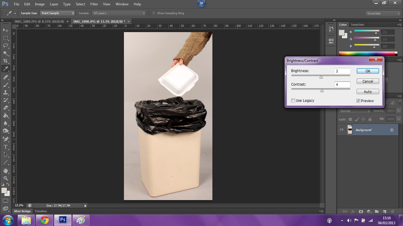
For editing the image I couldn't screen shot as I did it because it wouldn't work so I wrote down every step I took.The image opened in raw, i changed it 2010 and there was no clipping, I put the recovery up to 100%, put the blacks up 17, the brightness and contrast up to 50% and the clarity up to 100% I then opened it in photoshop. The first thing I did in photoshop was crop it down to the shape above, I used the cone tool as there was a bit of background wall in the image at the side, so I got rid of that. I then used levels: moved the white a quarter into the centre and a little move for the grey to add a little dark, I then made sure the exposed was correct. The last thing I did was sharpen the image with smart sharpen: lens blur, 37. And then on Indesign I added the text: my tag line was first "Even though the food won't last forever, but the memories will" I made the tag line slightly shorter so that the advert would be able quickly to translate its message across- I had the line all in black as well which I changed to white and grey so it was easier on the eyes and spilt up the text.
we had a mini peer crit, in which Ceri wrote down some notes about what she thinks of my image so far and what she thinks I should do to improve it:
Q:Is the image fit for purpose?
"Yes. Not sure about the tag line though."
Q:How could the image be used?
"To advertise dinning in."
Q:What good practise can you see in the image?
"Layout,font,simple,angles,symetry. Style writing."
Q:How could the image be improved apon?
"Bit more interest- plates etc. Lighting is cold,could add a tone to the picture."
Q:Any other construtive comments?
"A hand putting stuff on the table/laying the table?"
The tag line issue was confusing because Ceri doesn't like it but other people do,one person suggested changing it to "The food won't last forver, but the cutlery will" but I wasn't sure about changing it to this because it would have got rid of my family time link into the advertisement.
I don't really want to add any other objects into the image because I was aiming to get a sort of dinner table after or before it was used sort of look, I will think about having a hand in the image though. The cold lighting is a problem for me too but I think that added a tone could possibly make the cutlery look unclean.


I shot the idea again, this time with a table cloth. I also moved the position of the cutlery, shot it from a bit further back, and I think I'm a little higher too. I edited this image in almost the same way as the first: cropping, levels, sharpening, exposure, recovery, brightness and clarity- but this time I had to clone the very back on the table as the table cloth I used to cover it didn't cover it completely and some of the table was showing. I also cloned the right hand side knife because the table cloth was covering the end of it. And they text on the image will be added later on indesign.

I don't know if I'm happier with the image having the table cloth in it or wether I prefer it without: It definatly looks more professional and presentable then the first shoot but theres a lack of colour and an ovbious plainness which I dislike, I like the image without the cloth works better as an adervtisment that would be on a billboard or in a magazine where as I think the table cloth image would fit and look best in a catolog simply because the viewer will be looking through it with more interest and care rather than if it would be on a billboard where the viewer gets a 2 second glimps as they go by in a car to look at it. When I shot both of these shoots two people commented on how my images reminded them of Ikea pictures: so I did a bit of googling and looked at Ikeas images to see the similarities for myself.


When looking through them I saw that most of Ikea's images are of fuill sets made up of their furnature but then I came across some that were just the furniture shot on a white background, possibly/most likely in a studio. I think that my images are a mix of these two images: just as simple as the plain studio shot but theres more to it then just the cutlery.
The next subject we're advertising is biscuits, I'm feeling a lot more confident about this assignment after doing last weeks tasks and I know that creativity and the process of getting an idea off the paper is key in order to do the task successfully in the few days we have: I've already thought of three ideas consisting of two or more images.


The first idea's pitch and purpose is make the biscuits seem a nessesarity in day to day life, the images have a tag line of "Life wouldn't be the same without them" and the first idea I had was a set of studio images showing the different ways in which they are in our lives: the first being a person holding two of the biscuits up to their eyes(like glasses) with a big smile on their face as to say the biscuits are fun and can create good memories, the second image being a cup of tea and two biscuits next to it as to say that a cup of tea is never the same without them/ the two fit together perfectly, the third possible image idea that I'm not sure about doing is just a biscuit tin as to say that every house will have one and the forth image being two people smile and laughing, holding a half eaten biscuit in one hand-one person will be holding the packet in their other hand and I thought the other person could be gesturing a thumbs up or a celebratory air punch but I thought that might be a little cheesey. The second Idea I had for this was a close up of the biscuit, bitten or not with dramatic lighting coming from one side of it and this will be placed on all of the other images I take.


The second idea I had was then a tag line of "Oats So Serious" with my close up shot being of the biscuit wearing glass, possibly other smart clothes and my bigger image idea being of someone's school books and the biscuits placed next to them as to say that the biscuits help you get through doing work,
could also suggest that the biscuits are smart and if you eat them, they'll make you smarter.


The third idea I had was then a tag line of "A Whole Load Of Fun" or something based around fun and games. The bigger image being the biscuits stacked up on top of eachother(some could be bitten into) and maybe I'll have some hands coming into the image to represent the game Jenga, I also thought of using the game of noughts and crosses but I prefer the Jenga idea and the close up shot could be a simple but beautifull lit, detailed image of the biscuit: maybe I could use a snoot to create a spot light on the biscuit.
After deliberating for a few hours, whilst waiting for the studio, I drew sketches and had a good think about which of my three ideas I'd go through with and decided to scrap the second idea because it was the least strongest and I thought it'd be a tad cheesy and because of it being cheesy I thought it wouldn't be as affective as the other two. I then spent the rest of my time sketching ideas for the layout of the double page spread and picking certain images I could use on it. I was hoping to try both ideas and see what they looked like compared to each other in real images: these were the ideas I was thinking of:


Me and Ceri were the last people on the list to use the studio so when we finally got into the studio, we didn't have hardly any time to do it and had less then 10 minutes each taking images, so I couldn't play around with both of my ideas but I still managed to get both shots of at least one idea and be happy with them. I think there still a lot to improve though and the next shoot I have I will make sure to go first and take more! What I did for this shoot was try to take the cleanest looking box/pack shot I could, I was kneeling on a tall stool to get the flat "birds eye" angle I was after. The after I took a fair few shots of the box shot that I think I was happy with, I went onto the adverting image, I only used one person's hand in the image this time and the tower of 'jenga' biscuits, when shooting the images I was knelt on the floor, with a straight back trying to get level with the still life table and I was continually moving the biscuits and hand after each shot so I could find a composition I think worked best. and I did one birds eye view shot of adverting image because I wanted to see if the angle I was capturing the image in was the best one for that I was doing. When it came to editing the images I looked at them and thought the concept of jenga biscuits and fun wasn't coming across very strongly and the fact I only used one hand wasn't working either because you couldn't tell there was another person playing the game- I decided to shot it differently/add to it.
First shoot:


1) Cropped down. 2) Exposure corrected. (+16)


 1st light.(Left) 2nd light. (right)


Final advertising subject:
For the final section of the advertising brief, out of the things we had to choose from: bin liners, paper clips, plastic cups, take away boxes,b/w socks and dish clothes- I came up with ideas for two in particular, they just happened to be the two which I first said I wouldn't choose ironically: I had little visual ideas for the other choices like: having people standing in bin liners, having people with dish clothes round their head and other places on them etc, the only two options I didn't get any springing-to-mind ideas for at first was: take away boxes and plastic cups and then just by chance and a little consideration I ended up choosing the options I'd crossed off and these are the ideas I came up with:


Editing process:

 1) Crop. 2) Levels.


3)Exposure. 4) Brightness&Contrast.


 placed on a plain, poster background and played around with:


Test Shots of second idea:


Again before the third shoot I did , I did some skethes of layout ideas and new ideas. I also wrote down all the equiptment me and Sam use for the shoots we do. During the shoot, again we were rushed and I had very little time to do my images, I got to try out the new image idea though, found it was unsucessful though as it wasn't a normal thing to with a food container.


 1)Crop 2) Smart sharpen.

 3) Cloned background marks away. 4) Levels.

 5) Curves mask. 6) Cropped more.

 7) Cloned away box marks. 8) Skin tone correction.


5th shoot:
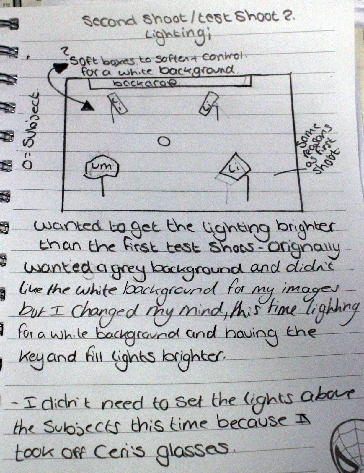
The day after the 4th shoot, I came in more prepared and filled with ideas I was wanting to try out, today's aims were to improve and hopefully shoot my final images for the advertising campaign, I had a good chunk of time to get it shot in as well this time for a change. This time I brought in hair things(hairspray,hair clips etc) I got her hair and make-up done before I went in the studio to shoot. There was a unexpected lack of extra lights in the equipment hatch though, so when I went to get the light meter, trigger, receiver and an extra light for my background- I couldn't get one as they were already being used by someone else, so I had to make do with only one light lighting the backdrop and I had Sam holding a reflector on the opposite side, bouncing light towards the backdrop. After almost an hour of shooting I managed to re-shoot my idea from the day before, try out a few different poses- this time I was thinking about the format of my images for what I needed them to be for the adverts so I did a mix of portrait and landscape images this time, and by the end of it I have a good fair few of each format/advert type to choose from and edit.


 1) I made a mistake when taking this one image(just happened to one I wanted to use), the light had being too close and burnt out one side of her face, so I had to learn how to hide it the best I could.

 2) Auto tone & Shart Sharpen. 3) Skin tone correction.

 4) Cropping. 5) Cloned out background marks.

 6) Cloned background to same colour/light.


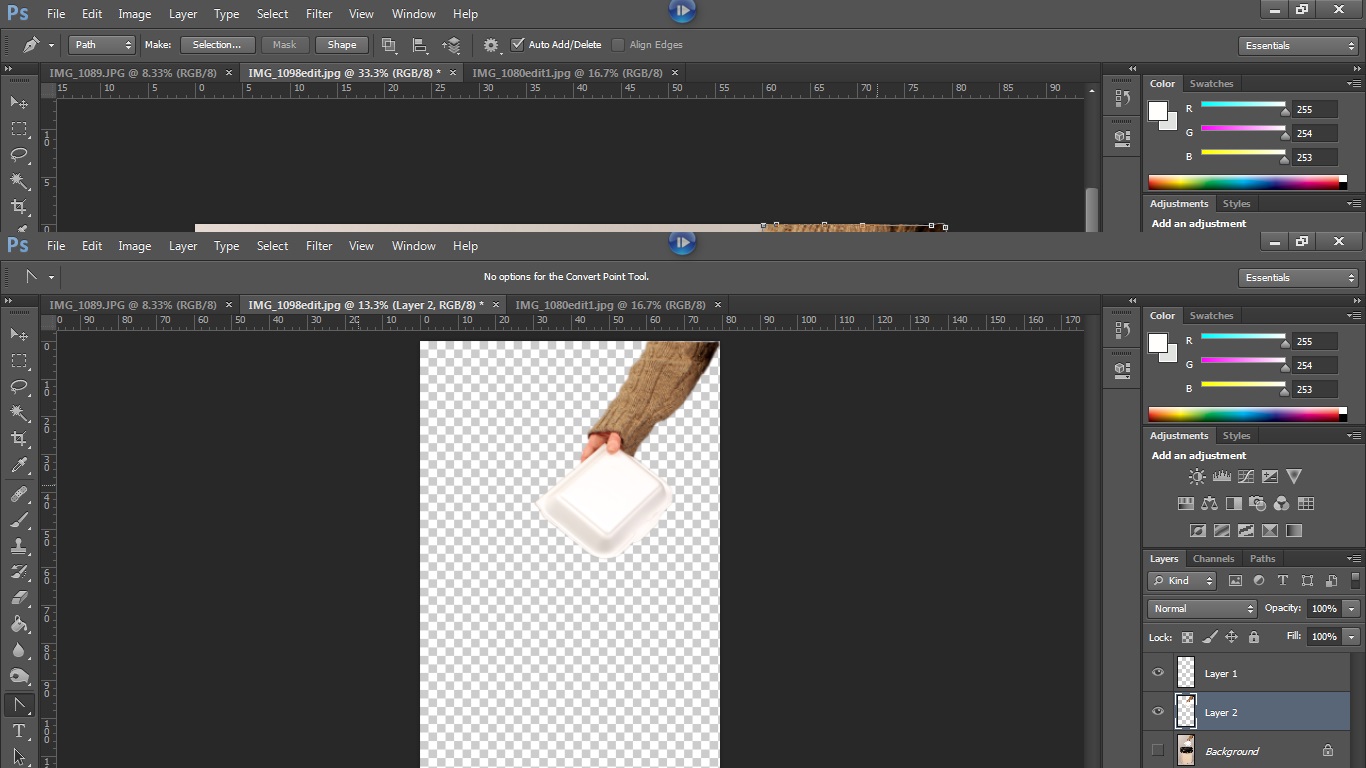
 8)Pen tooling. 9)putting the pen tooled layer onto a different, blanc Photoshop file.


Finished advert for internet banner:

After deliberating for a few hours, whilst waiting for the studio, I drew sketches and had a good think about which of my three ideas I'd go through with and decided to scrap the second idea because it was the least strongest and I thought it'd be a tad cheesy and because of it being cheesy I thought it wouldn't be as affective as the other two. I then spent the rest of my time sketching ideas for the layout of the double page spread and picking certain images I could use on it. I was hoping to try both ideas and see what they looked like compared to each other in real images: these were the ideas I was thinking of:


Me and Ceri were the last people on the list to use the studio so when we finally got into the studio, we didn't have hardly any time to do it and had less then 10 minutes each taking images, so I couldn't play around with both of my ideas but I still managed to get both shots of at least one idea and be happy with them. I think there still a lot to improve though and the next shoot I have I will make sure to go first and take more! What I did for this shoot was try to take the cleanest looking box/pack shot I could, I was kneeling on a tall stool to get the flat "birds eye" angle I was after. The after I took a fair few shots of the box shot that I think I was happy with, I went onto the adverting image, I only used one person's hand in the image this time and the tower of 'jenga' biscuits, when shooting the images I was knelt on the floor, with a straight back trying to get level with the still life table and I was continually moving the biscuits and hand after each shot so I could find a composition I think worked best. and I did one birds eye view shot of adverting image because I wanted to see if the angle I was capturing the image in was the best one for that I was doing. When it came to editing the images I looked at them and thought the concept of jenga biscuits and fun wasn't coming across very strongly and the fact I only used one hand wasn't working either because you couldn't tell there was another person playing the game- I decided to shot it differently/add to it.
First shoot:

(^cropped it down, made a path with pen tool, made it a section, layer via copy- result is image below)

then I cloned in the parts of the biscuit that were missing, and cloned the biscuit so that it looked less crummy and more presentable. This is the final edited image:


1) Cropped down. 2) Exposure corrected. (+16)


3)Levels. 4) Contrast up 13.


5)Smart Sharpen. 6) Cropped in more.


7) Brightness up 6.
8) I tried putting both images together as a single image advertisement and added font.
Final edited image:


Second shoot:
The lighting set up^ Two soft box lights pointing down at the light table, a snoot behind/under the light table. And we used a white card under the biscuits this time so that the surface was more clean. (when we did the first shoot we didn't include the snoot or the white sheet.) This time my main aim was trying to bring out the game concept more- I didn't have a second person though so I thought of another way to do it: in the game jenga when you pull out the bricks successfully you put them to one side of you, so I though of having a few biscuits at either side of the tower as to show the concept of the game more, and to make it seem like their was another person there, without there actually being a person there- but because I was adding more to the image I couldn't frame my image as I took it, I had to take the image with lots of background room which exposed the paper so I could crop it down how I wanted it. I also took the images at quite a lot a different levels and angles this time again, experimenting to see if I was defiantly going to use to level shot or weather I could find one I liked better. I also shot some box/pack shots again but decided I preferred the first shoot's one. When I was going through the images after shooting, I noticed that they looked really soft and too light at certain points and this was because there was too much light being reflected onto the biscuits at the time, I was disappointed to say the least as it was the case for all the images even though I couldn't see the problem in camera at the time, I managed to be able to save the images though in photoshop as when I edited the image below it looked much better when I'd finished processing it- I'm reshooting for a third and final time though as I want to sort out the exposure problem and I thought the image would look a lot better if there was a second hand in it.


1) Opened in raw: recovery 43, black 27, clarity +53.
2) Cropped and clone top of background white.


1) Levels. 2) Exposure correction.


3) Shadows & Highlights. 4) Cloned & filled background.

5) Smart sharpened.
Final image from second shoot:

Final shoot:
This time I did my lighting a different way, I took it a light at a time in order to get the exposure right and the highlights where I wanted them, I tried the left hand side light first and liked the shadows it created and the highlights it made so I left it how I placed it first, I then tried the left and right lights together and I turned it up/placed it further away from the table so that it hit where I wanted to, then I turned on the light attached to a floor stand we had underneath the table so that it would light underneath and get rid of the harsh shadows, we turned it a few steps brighter too.
3.Third light.(underneath table) 4. Third light brighter.


Editing process:


1)Raw. 2)Levels.


3,4,5 and 6= cloning the background white and getting rid of any marks.
Final advertising subject:
For the final section of the advertising brief, out of the things we had to choose from: bin liners, paper clips, plastic cups, take away boxes,b/w socks and dish clothes- I came up with ideas for two in particular, they just happened to be the two which I first said I wouldn't choose ironically: I had little visual ideas for the other choices like: having people standing in bin liners, having people with dish clothes round their head and other places on them etc, the only two options I didn't get any springing-to-mind ideas for at first was: take away boxes and plastic cups and then just by chance and a little consideration I ended up choosing the options I'd crossed off and these are the ideas I came up with:


The first ideas based on the takeaway boxes I came across by being inspired by the old cheesy adverts like these:


not all the ideas are linked with the cheesy old advert style but the ones that are I had this sort of idea in mind, not like cartoony but the style and speech of it. I test shot one of the ideas I had for the takeaways boxes today. The ideas I has were based on the fact that the takeaway boxes make it so you can eat and not have to wash up after, you can just through them away, and there was one idea where I was inspiring it on woman-ism, where the husband, lounging in a chair is asking "what's for tea" and the wife responds like "something made especially for you" holding the take away box.

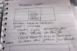
The plastic cup idea I only have this idea for at the moment, the traffic light idea: based on the fact that the plastic cups are for water foundations and places where your out and busy- the fact you can just go grab a cup and get a drink rather than have to stop your day to get one, is what I was going for, the fast and easy way to drink through a buy day... which is where I got the traffic light idea from, suggesting the theres no stopping, and literally having no stop part in the traffic light and I thought after as an improvement I could possibly have a hand coming into to take the "go" cup giving it more context and more meaning.
Test shots of first idea:


Editing process:


3)Exposure. 4) Brightness&Contrast.


5) Sharpen. 6) thought about croping the image further.
Final edits:


1) Cropped 2) auto tone and contrast 3) smart sharpen 4) straightened.


5) levels. 6) shadows.

7)Brightness&Contrast. 8) Exposure check.
pen tooling around the images:


Resized and sorted out the tops of the cut outs:


Test advert:


lighting diagram for this shoot:

Second shoot:
Before the second shoot, I did some sketches based on what the images would be placed like and the layout of them if they was on a billboard or a poster, then I went into the studio with little time to shoot, filled three plastic cups with lemonade, and two with food colourant I then used the light table to shoot the shots of the drinks. I quickly saw how limited the shots were and I instantly didn't want to continue using the idea but I still edited one of the images to see what the finished result would be, only to feel the same way.


 |

Editing:


1)Levels, crop, auto tone, auto contrast, crop, masked to brighten background.


masked the whole time and ran out of time to finish it...

Third shoot:
this is the unfinished edit ^
I've now decided that I'll be producing a campaign based on takeaway boxes in which at least three different images are going to be representing it, in different presentations(Billboard, Poster and an internet banner) my Idea for advertising it may change but I will still produced the mentioned above.
Again before the third shoot I did , I did some skethes of layout ideas and new ideas. I also wrote down all the equiptment me and Sam use for the shoots we do. During the shoot, again we were rushed and I had very little time to do my images, I got to try out the new image idea though, found it was unsucessful though as it wasn't a normal thing to with a food container.


We had a mini critique in one lesson, I didn't really have my idea together at the time so I couldn't really get any feed back that would still be relevant later on because I was pretty sure the idea and direction I was going in was going to change but the critique's comments were: Good slogan, font work "healthy font". Concept well communicated. The said I should work on student-takeaway stereotypes because I wasn't meaning it to aim at students but they said it reminded them of the student life stereotype. They said not to use bins in the advert and I agree'd something about it being in the advert wasn't working: they said there was something horrible about them, they didn't want to be reminded of bins and not to associate them with food which are both really good points but I thought that not having to wash up was a good selling point towards the take-away boxes and fit with the slogan. I got suggested to use light table to get rid of shadows and someone said in the advert layout I made was a bit strange because the bin was floating- They agreed that bins look weird unless on the ground, so no floating bins.
After having no success with my shoots and ideas so far I've kind of lost motivation to go ahead with them, I don't like the ideas I've tested and the idea I do actually like, I think would be next to impossible to try to visual recreate with the lack of time and lack of people to model it. I'm going to try though, since it's the idea I have most inspiration and visual for- first I'll have to look through the costume department for outfits. Below are some of the images I've found using the same kind of old style/modern day advertising that are kind of what I want to go for, not really what I imagined but give a good example: the old clothes, hair and the cheesey-ness.


I was researching some more and I have found the style of advert that I was originally inspired by, this is the kind of style I was more influence towards when taking/creating my images- the 1940's advert style:


Forth Shoot:
After trying a 1940's style with my own hair in the way I was going to style my models, it didn't go so well but I thought that hair would be an issue for another day, so the next day I shot my first test shots of the 1940's advert style idea, using the dress I picked out from the costume department and quickly changing my models hair so it fit with the style a little better. The images obviously are not perfect or anywhere near, it was just to get an idea about how I could recreate and how well I could, I could also see how I could create it better too so this shoot really helped me to see that it was possible to create the idea I had in my head and how I should go about it to make it better.


9) teeth whitening.

5th shoot:
The day after the 4th shoot, I came in more prepared and filled with ideas I was wanting to try out, today's aims were to improve and hopefully shoot my final images for the advertising campaign, I had a good chunk of time to get it shot in as well this time for a change. This time I brought in hair things(hairspray,hair clips etc) I got her hair and make-up done before I went in the studio to shoot. There was a unexpected lack of extra lights in the equipment hatch though, so when I went to get the light meter, trigger, receiver and an extra light for my background- I couldn't get one as they were already being used by someone else, so I had to make do with only one light lighting the backdrop and I had Sam holding a reflector on the opposite side, bouncing light towards the backdrop. After almost an hour of shooting I managed to re-shoot my idea from the day before, try out a few different poses- this time I was thinking about the format of my images for what I needed them to be for the adverts so I did a mix of portrait and landscape images this time, and by the end of it I have a good fair few of each format/advert type to choose from and edit.


I went through each of the images I took and picked out the ones I felt were the strongest, wrote them down and then started editing them.


7) The arm also had blown out a little on the edges, so I cloned that away too.
After editing most of the background I noticed that it wasn't going to work out how I was doing it, so I decided to pen tool out Ceri and put her on a white Photoshop document instead, I then edited the "Ceri layer" more:


10) hue and saturation masks to change skin tone and teeth whiten. I also added a warming filter to the image to make it seem more homely and less harsh.

11) I then added text(had to come up with a tag line and company name first) I found it hard finding a suitable text for the advert and I'm still trying to find the right font.

12) I thought Ceri looked a bit too flat so I tried to add some depth by upping her dark levels and adding shadows&highlights.

13) I've decided to keep this font, It was text size and placement that was needed to be changed after, I also moved Ceri more to the centre of the page in this one- I think it made a big impact on the advert's effectiveness.

14) There was something about the text that still bugged me, so I made sure it was straight and aligned, I made it slightly bigger and moved it higher.

15) Curves mask to bring back blown out hair, and highlighted and contrasted box to emphasize and to make it stand out from the background. & changed text colour.

16) Adding more warming filter and made background whiter.
second edit:


1) pen tooled around Ceri. 2) make a selection from the pen tool, create this into a new layer.


3) layer put onto a new, blanc document sized for a billboard. 4) Skin tone connection and teeth whitening.


5) Spot healing tool to get rid of loose hairs, also did this for the forehead/hairline 6) used a mask to curves back the burn out hair.

 7) smoothed out edges out the pen tool layer, and made hair look tidier but I don't know if this is good or bad.
I have realised that the two layers I made don't work together and can't work together, so I'm going to have to get rid of one I think. 8) I had to delete the layer "smooth edges" and do these changes again, but improving upon them.


I have realised that the two layers I made don't work together and can't work together, so I'm going to have to get rid of one I think. 8) I had to delete the layer "smooth edges" and do these changes again, but improving upon them.


9) there was a bit of Ceri's sleeve coming down from her dress so I had to get rid of it. 10) skin soften.
I then lost these steps as the file closed down before I saved so I did them again.


I then lost these steps as the file closed down before I saved so I did them again.


10) I attempted to warp Ceri's neck to extend it more but both the warps didn't go right, I'm not very experience with this tool, I wasn't sure about how to go about it really.


11) Added text, Adjusted levels and curves too. 12) Adjusting text, correcting layers(all the problems I've had with this edit, made my layers messed up) and I also moved the image.

 13) Edited image contrast. 14) Added highlights to the box to give more attention and emphasis to it.


15) I stil wasn't happy with the font I had so I went on Dafont.com and had a look for one more suitable. I noticed that on all the adverts of the 1940's they used more than just one font.


15) I stil wasn't happy with the font I had so I went on Dafont.com and had a look for one more suitable. I noticed that on all the adverts of the 1940's they used more than just one font.


16) changed the size of my canvas and image so I could have more freedom to move my images and text about.


17) After getting the font right, I worked on adding something extra to the adverts to give it more of the 1940's style.


edited+neck(hairs+and+shaddow+gone).jpg)


18) I noticed there was a white outline around from when the background was white so I went round her with the eraser tool to get rid of it.


19) Completely got rid of the white lining around Ceri and changed the colours of the background, something about them didn't quite fit together, too dark and bold I think.
I then changed the font and added more to the second advert, I also changed the tag line:


1)Pen tooled, Smart sharpen. 2) Auto tone, Teeth whiten.


3) Levels. 4) Pen Tool box.


5) Straighten out. 6) Curves.

edited+neck(hairs+and+shaddow+gone).jpg)
7) Getting rid of marks and fibre hairs. 8)Edited neck to get rid of loose hairs and shadows.


9) Shadows and highlights. 10) Brightness&Contrast.


11) Blur. 12) Getting rid of Sleeve.


13) Dodge and Burn face. 14) Bringing hair back.


15) Putting all the layers together and making the background. 16) Adding text.


17&18) Layout and text.

19) colours.
Finished advert for poster/magazine:

Finished advert for billboard:


Evaluation:
What went well about my work was that I did manage to successfully create a 1940's sense and aesthetic to my final images/adverts, I'm very happy with how they all turned out and happy that I actually went through with my original idea even though I was scared it wouldn't work out the way I imagined it would- I defiantly feel more confident with creating my ideas now, I feel confident that I'll now be able to improve myself more since I'll be less held back by fear of the idea falling flat- I've learnt that even if the idea seem far fetched or hard, try it anyway because you never know. The editing process and editing side of this project went well too, I have learnt a lot more techniques and can now use them successfully- others techniques still need work but at least I've tried them and I can always try again and hopefully I'll be able to do them in future. Over all I think just how I feel about my end work compared to the last couple of projects I've done went well, I'm actually happy with my work this time as opposed to not liking my work or wishing I'd done another idea- also this time I got to go through my natural thought process and test multiple ideas before settling on an idea that I'm happy with rather than just settling on an idea for the sake of the deadline which I've had to do a few times because of lack of time and my natural thought process being incomplete.
What I feel didn't go well about my work/the project was the rough patch I had at the start- testing out two ideas and coming out the other end with neither of them really being successful or inspiring, I really wouldn't have being happy with them being my final pieces- it was my natural way of thinking though, I always seem to hit a wall and hard before seeing the reason why I'm there to start with, I needed that push into making me take a risk with the 1940's idea so I'm glad it happened to be honest, I just didn't like the feeling of being behind and unmotivated towards something I'd spent half my time on already and because of this I only managed to fit in two 1940's shoots- I would have preferred to have done a few more to see if I could have taken it further- I think sometimes I need to learn that my first idea is my best and I shouldn't doubt it because it would save time and over all make out for a better result in the end.
The effectiveness of my champaign I would say for a female audience is very effective- it supports woman-ism and being strong and smart and I think it's a very attractive cause for woman- just standing up for themselves so by picking this angle I've created a way for woman to relate, to understand, to follow and to buy of course. It's also attractive to men as well because what man doesn't like a take away? plus no washing up, they can eat messily if they want and I think men are more towards woman-ism in this day and age too so they'll probably support it themselves if not support it for there partners liking! I made the adverts all have the same model, some font, same colours and same features in them so having them on a billboard etc- people would defiantly recognise 1 or more of these continuous factors I've used in each advert matched with the tempting taglines to draw them in and morale them in a way.
The adverts I've created defiantly meet my proposal and the brief set as I stated I'd be advertising take-away boxes as a billboard, poster and internet banner- I mentioned the way I advertised it may change and it did but I still created three takeaway box adverts in those 3 formats.
No comments:
Post a Comment